.svg)
HUB
/ Blogs /
March 12, 2026
Luxury Product Branding & Launch Strategy for Vera Wines
The Anatomy of a Quiet Launch
With absolute visual and digital excess, pure comfort has become the ultimate sophistication. When we first sat down with the founders of Vera Wines, the mandate was not simply to create another beverage company. The objective was to capture an invisible, fleeting moment. Vera Wines is entirely designed for the state of grace that follows the first pour.
The Solution for Digital Excess
At Veloura Solutions, we constantly remind our clients that a successful business launch is never about shouting the loudest in a crowded room. It is about speaking with such quiet authority that the room stops to listen.
Consumers are overwhelmed by choices, loud claims, and constant performance. Vera Wines was built as a direct antidote to this fatigue. There is no ornament. There is no performance. There is only the deliberate displacement of noise.
Defining the True Objective of Luxury Product Branding
This case study dissects the architecture of the Vera Wines project. We will explore exactly how to start a luxury brand from the ground up, moving seamlessly from conceptual philosophy into tactile product design and finally executing a highly calibrated launch strategy. For this brand, presence is the ultimate strategy. This is the story of how we fused evocative design with strategic backend systems to help Vera Wines scale with soul.
The Challenge: A Market Drowning in Excess
To understand the magnitude of this brand transformation, one must first look at the traditional landscape of the wine industry.
The Cacophony of Traditional Wine Branding
Walk down the aisle of any premium wine retailer and you are immediately bombarded by a cacophony of visual noise. Brands rely heavily on historical posturing.
Labels are cluttered with elaborate family crests, gold foil typography, sweeping illustrations of chateaus, and exhaustive tasting notes that dictate exactly what the consumer should be tasting. This environment creates a profound sense of cognitive overload. The modern consumer is tired of being told what to think and how to feel. They are seeking spaces of psychological relief.
Identifying the Market Void
When analyzing how to start a luxury brand in a saturated market, identifying the void is your most critical first step. The void we identified for Vera Wines was the sheer absence of silence. The market did not need another wine boasting about its ancient terroir or its complex notes of crushed blackberry and leather.
The market needed a wine that offered emotional comfort. The core challenge was conceptual. We needed to figure out a way to command a premium price point and establish absolute authority without relying on the traditional, loud tropes of the industry. We had to prove that an absence of decoration could translate directly into a high value perception.
The Strategy: Presence as the Ultimate Strategy
Our foundational approach to luxury product branding always begins with an internal audit of intention. For Vera Wines, the strategy crystallized around a singular phrase. No ornament. No performance.
Engineering the Emotional Baseline
We completely shifted the focus away from the liquid in the bottle and placed it entirely on the human experience of the drinker.
We realized that people do not just buy premium wine to taste fermented grapes - they buy premium wine to facilitate a specific emotional transition.
- They are buying the exhale at the end of a long workday.
- They are buying the intimacy of a shared conversation across a dimly lit table.
- They are buying a temporary state of grace.
This required a radical departure from standard industry marketing.
True luxury product branding is about engineering an emotional baseline for your consumer before they even uncork the bottle. You are not selling a commodity. You are selling a shift in perspective.
The Core Strategic Pillars for Luxury Product Branding
By committing to specific strategic pillars, we established a foundation that was practically impossible for traditional heritage brands to replicate. They are too tied to their noisy histories. Vera Wines was free to simply exist.
- Radical Simplification: We stripped away every single element that did not directly contribute to a feeling of calm presence.
- Sensory Autonomy: We refused to put tasting notes on the bottle. We allow the consumer to project their own experience onto the wine rather than dictating it to them.
- Quiet Confidence: We utilized negative space as the primary vehicle for communicating premium value.
Luxury Product Design: The Displacement of Noise
Strategy is only an idea until it is translated into the physical world. The product design phase for Vera Wines was an exercise in intense, meticulous restraint. We had to physically manifest the concept of displacing noise.
Translating Strategy into Tactile Reality
When executing luxury product branding, the tactile experience is just as important as the visual one. The human hand is incredibly sensitive to quality. A premium price point must be justified the moment the consumer picks up the bottle. By removing the expected visual clutter, we created a blank canvas. The bottle does not demand attention, but its quiet authority naturally draws the eye.
The Physical Execution of Silence
We broke down the physical components to ensure every touchpoint felt incredibly intentional.
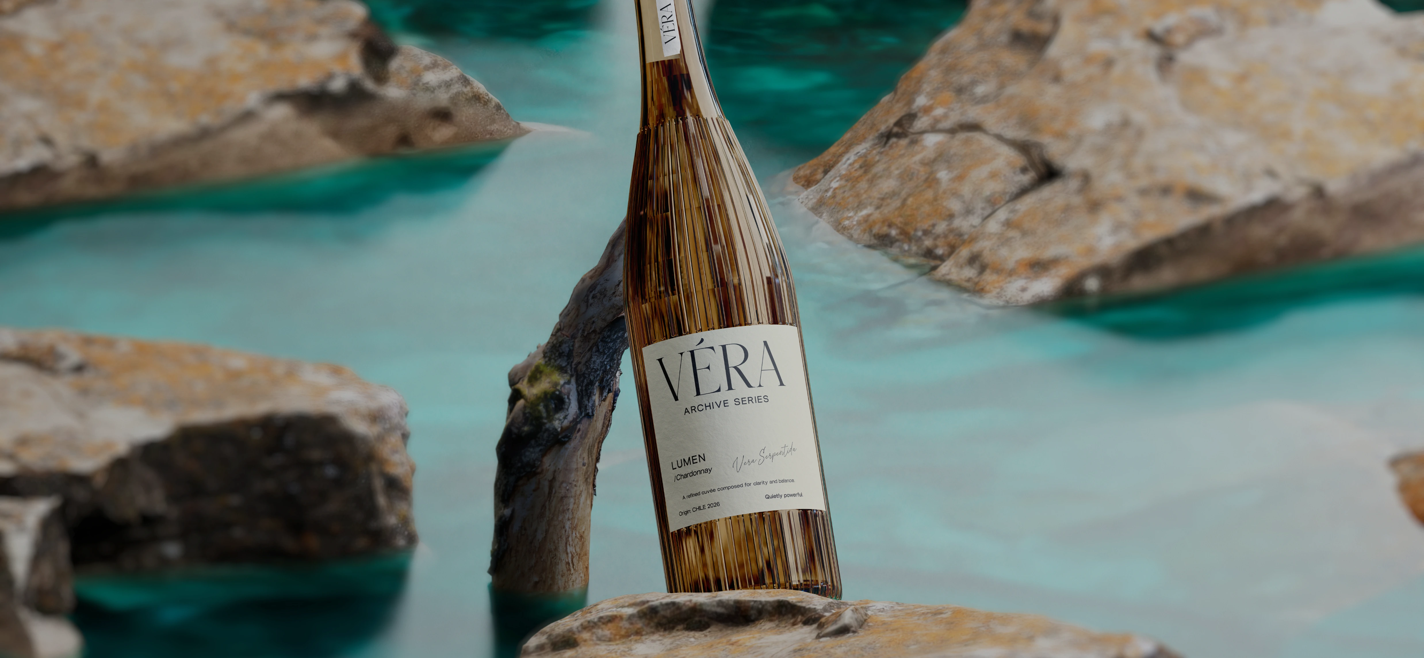
- The Bottle Silhouette: We moved away from the standard sharply angled Bordeaux bottles. Instead, we sourced a custom glass mold featuring softer, sloping shoulders and a surprisingly heavy base. The weight of the bottle grounds the user, subtly communicating significance and intention.
- The Materiality of the Label: The label design was stripped down to the absolute bare minimum. We utilized a heavyweight uncoated cotton paper stock that feels more like fine art stationary than a commercial sticker. The texture absorbs light rather than reflecting it.
- Typographic Restraint: We avoided elaborate scripts and serif fonts entirely. The brand name is presented in a custom, highly structured sans-serif typeface. It is blind embossed into the cotton paper. This means there is no ink used for the primary logo. The name is only visible through the subtle play of shadow and light across the debossed texture.
- The Seal: Instead of a shiny metallic foil capsule, the cork is sealed with a matte, neutral-toned wax. This requires a physical, tactile effort to open, turning the act of uncorking into a deliberate mindful ritual.
The Backend Systems: Scaling the State of Grace
At Veloura Solutions, we know that the most beautiful product design in the world will fail if the business operations are chaotic. You cannot sell a state of grace if your customer service is disorganized or if your shipping logistics are unreliable.
Fusing Frontend Beauty with Backend Logic
Evocative design must be fused with strategic backend systems to scale your business with soul. For the Vera Wines business launch, we spent just as much time engineering the invisible architecture of the company as we did designing the physical bottle. When operations align perfectly with brand identity, a business becomes truly iconic. The customer feels a seamless continuity of luxury from the first Instagram post they see to the moment they recycle the empty shipping box.
Strategic Operational Alignment
- Inventory Management: We implemented a highly controlled, small-batch release model. This backend decision supported the frontend narrative of intention and care while simultaneously preventing inventory bloat and protecting cash flow.
- The Digital Experience: The direct-to-consumer website was built to mirror the bottle. It features expansive white space, intuitive navigation, and a frictionless checkout process. A complicated digital purchasing journey would instantly destroy the feeling of comfort we worked so hard to cultivate.
- The Unboxing Ritual: When a customer orders Vera Wines online, the shipping materials continue the brand story. The custom boxes use the same minimalist typography. The internal packaging secures the heavy bottles without using cheap bubble wrap or messy packing peanuts, utilizing custom-engineered recyclable pulp molds instead.
The Business Launch Strategy: Entering the Market with Intention
A brilliant product requires a brilliant introduction. The launch strategy for Vera Wines needed to respect the brand core philosophy. A loud, aggressive marketing blitz would have completely contradicted the displacement of noise concept.
Bypassing Traditional Channels
We had to design a business launch that felt like a quiet discovery rather than a desperate sales pitch. We bypassed traditional beverage marketing channels entirely. We did not buy billboard space. We did not send mass mailers to generic wine reviewers. By cultivating an aura of exclusivity and quiet confidence, we generated immense organic demand.
The Phased Rollout Strategy
- The Whisper Campaign: Three months prior to the official business launch, we began seeding the product. However, we did not send it to typical lifestyle influencers. We sent unbranded matte-black tasting boxes to aligned creatives in adjacent industries. We targeted minimalist architects, high-end interior designers, and fine art photographers. We knew these individuals deeply understood the value of negative space and restraint.
- Intimate Experiences: We hosted a series of hyper-exclusive ten-person dinner parties in architecturally significant homes across major cities. There were no step-and-repeat banners. There were no brand ambassadors giving loud speeches. We simply poured the wine and allowed the product to facilitate the conversation.
- The Digital Unveiling: When the digital storefront finally opened, it was not announced with a loud blast. It was announced with a beautifully shot short film showcasing the slow pouring of the wine into a glass, accompanied only by the ambient sound of the room.
Conclusion: Pouring with Soul
The Vera Wines case study is a testament to the power of unwavering strategic focus. It proves that in a deeply saturated market, you do not need to perform to be seen. You simply need to be fiercely intentional.
By stripping away the historical baggage of the wine industry, we allowed the true essence of the product to shine. We demonstrated how to start a luxury brand by focusing on the psychological needs of the consumer rather than the traditional features of the product. The meticulously restrained product design paired with flawless backend systems and a whisper-quiet launch strategy positioned Vera Wines as an instant modern classic.
Presence truly is the ultimate strategy. When you stop competing on noise, you elevate yourself into a category of one. You allow your customers to experience the comfort of sophistication. This is what it means to pour with soul.
See the Full Branding Case Study On Behance
Your Next Step
The Aura Alignment Call
This is the first step toward turning your business into an iconic brand. Book your session here:
During this 45-minute deep dive, Katarina (our Co-Founder and CEO) will personally audit your current brand positioning and identify the 'Aura Gaps' holding you back from high-end scaling.
What we’ll cover:
- Brand Audit: A raw look at your current visual and strategic presence.
- Roadmap Blueprint: The specific shifts needed to reach your next revenue milestone.
- The Aura Method: A custom-tailored strategy that can be applied to your specific niche.
Important: Please ensure you have filled out the booking questions in full. Katarina spends time reviewing your digital footprint prior to the call so we can skip the fluff and get straight to the strategy.

Ready to Reignite, Rebrand & Rise?
Let’s Talk About Where Your Brand Is — And Where It’s Meant To Go.


